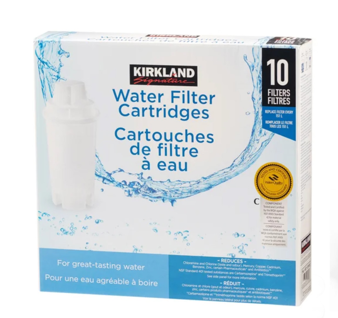
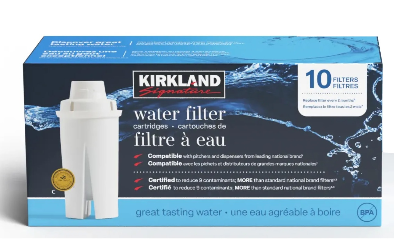
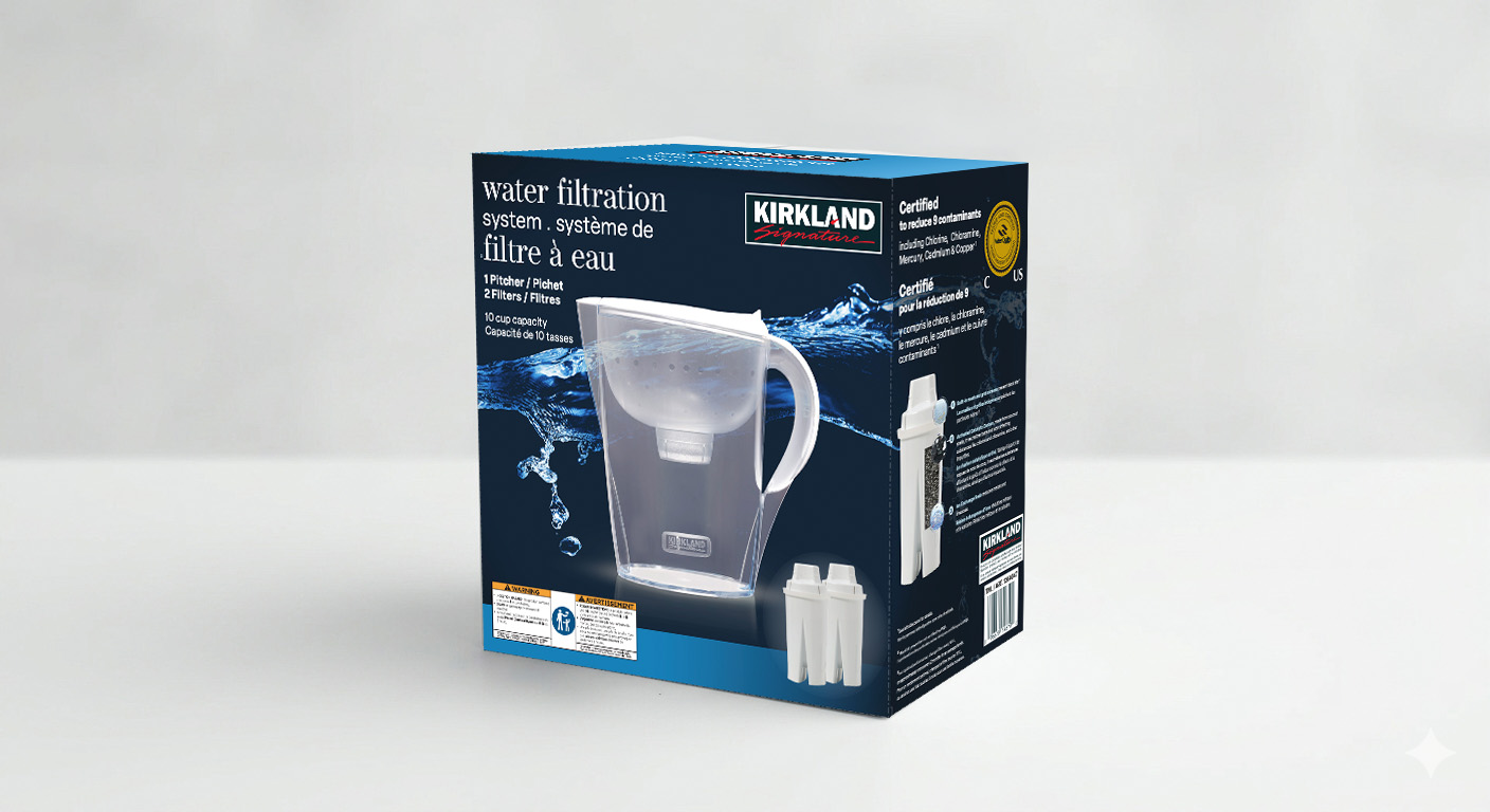
The goal was simple: create packaging that stands out on the shelf, clearly showcases the filters and their benefits, and opens customers' eyes to a better, cheaper choice.
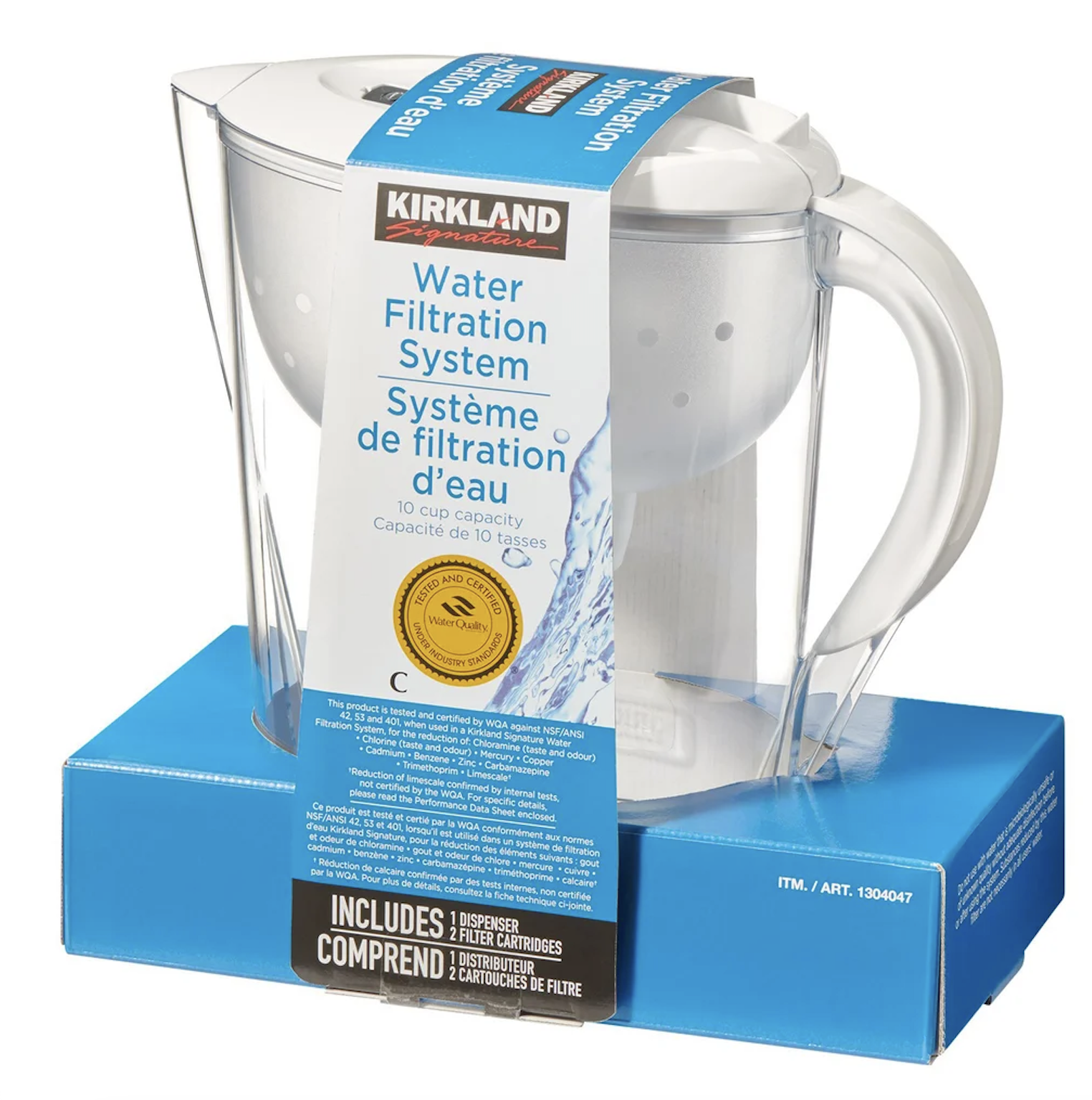
MAVEA filters, sold under the Kirkland brand at Costco, needed a refresh to match their bold and innovative legacy. The existing packaging lacked personality and repeated the same information on both panels missing the chance to highlight superior performance compared to Brita.
What looked like a straightforward packaging refresh turned into a masterclass in multi-stakeholder alignment.
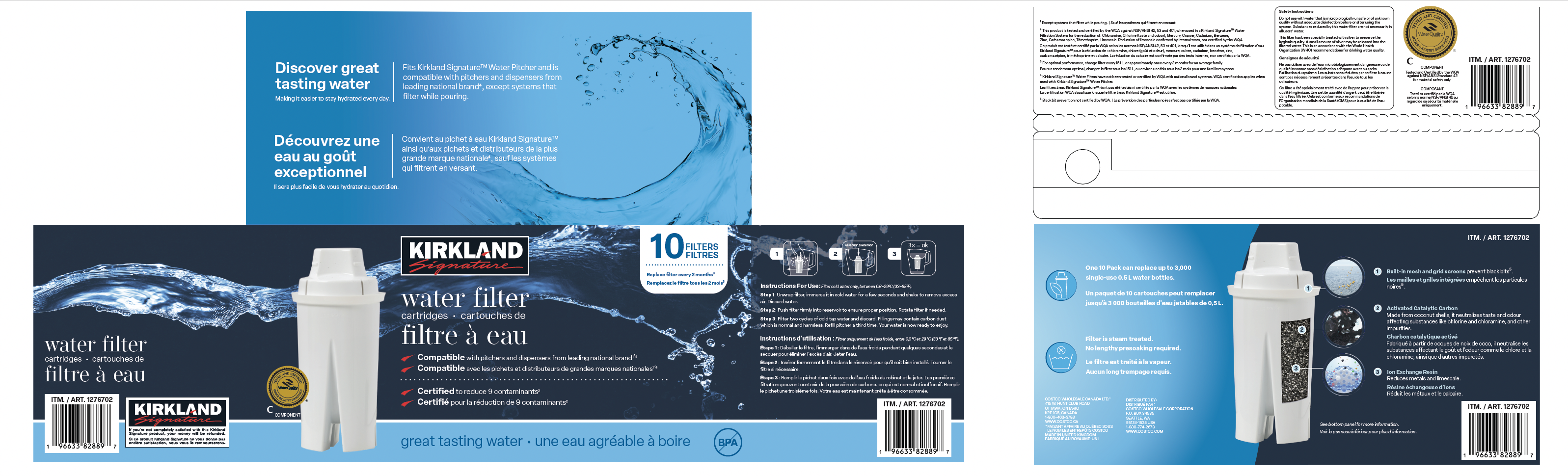
While the product originated from MAVEA, it was being rebranded under Kirkland Signature introducing layers of approval from Kirkland's legal team, buyers, and their CEO. I was also collaborating closely with the MAVEA team while BRITA's production team in Germany handled printing. The biggest constraint? Every word had to appear in both English and French, and on the pitcher packaging, no copy edits were permitted at all. We had limited control over the text but needed to deliver a design that still felt clean, cohesive, and on-brand.
Final print-ready files delivered for Canada, USA, and combined markets including dieline updates when the pallet tray layout changed mid-project.
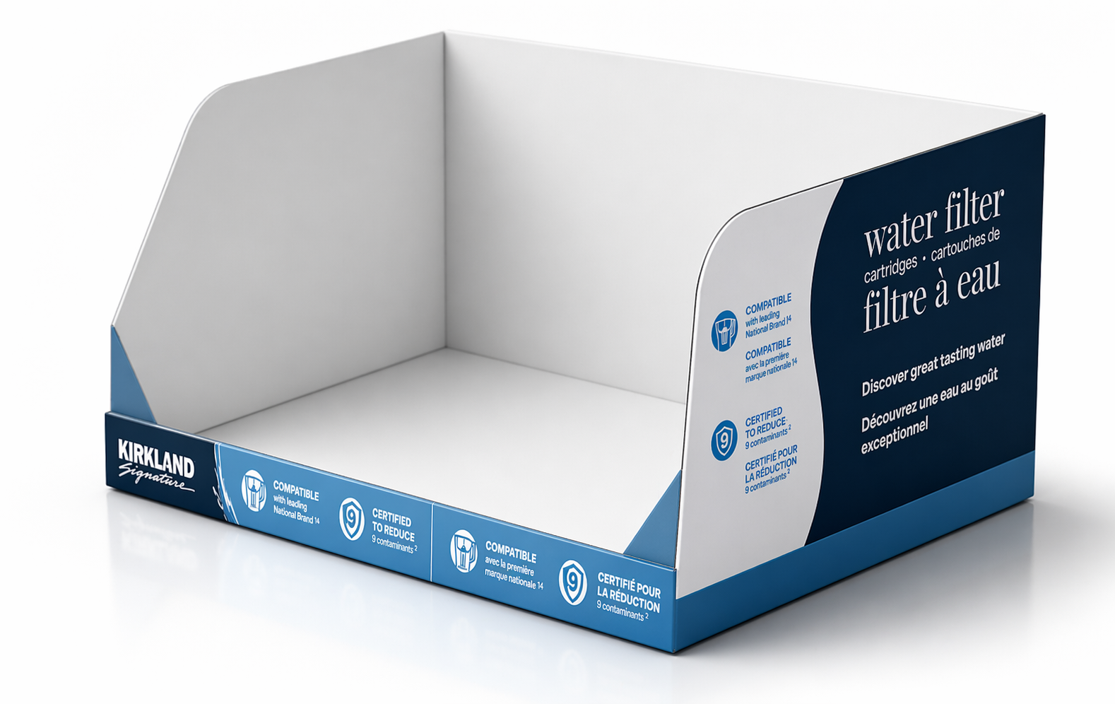
Once the filter packaging was refreshed, everything else suddenly looked out of place. What started as a single project expanded into a full system refresh.
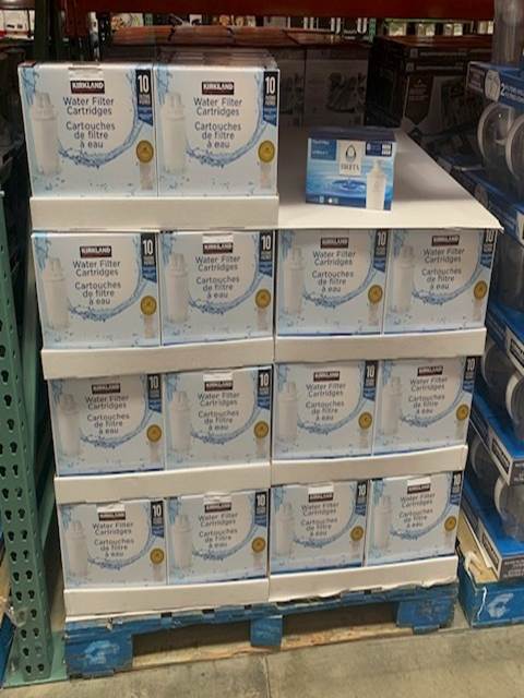
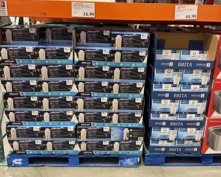
Live on shelf at Costco before and after the refresh.
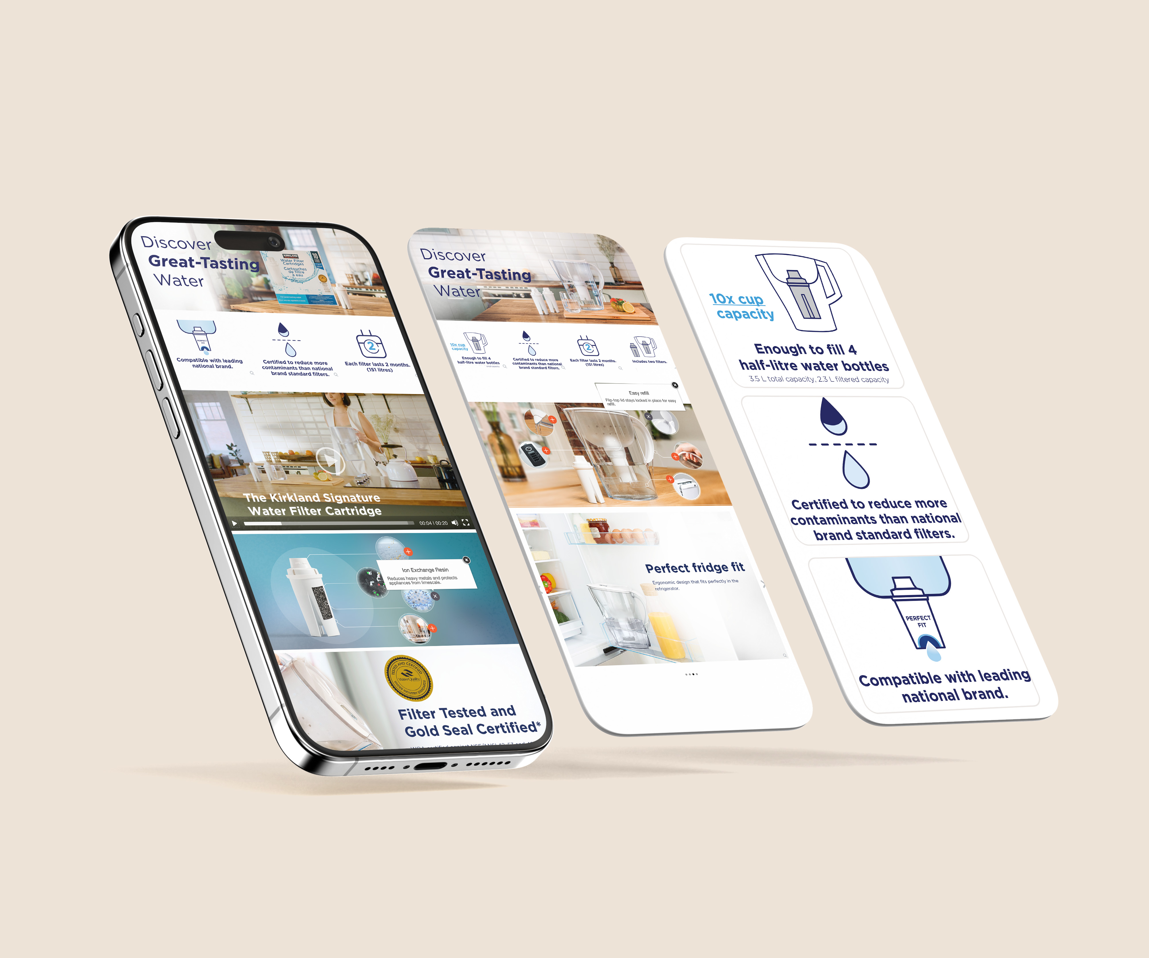
I art directed two lifestyle videos and designed the A+ content for both the water filter and pitcher product pages on Costco.ca bringing the packaging story into the digital shelf.