Target Packaging hero
PackagingRetailTarget Up&UpIconography

Retail Packaging Refresh for Target

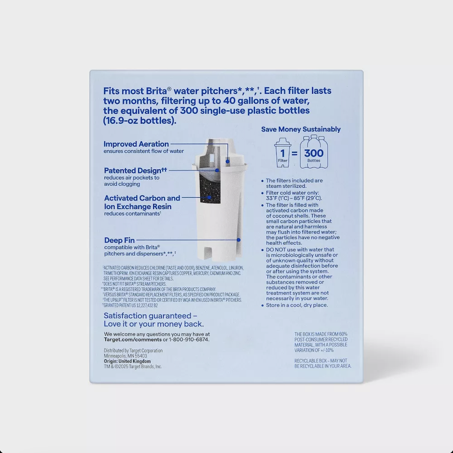
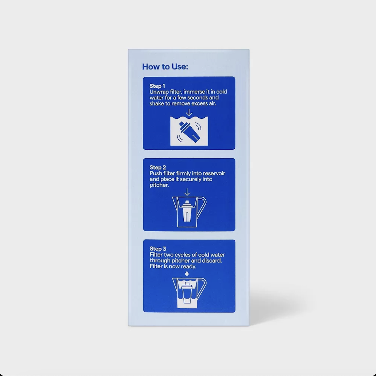
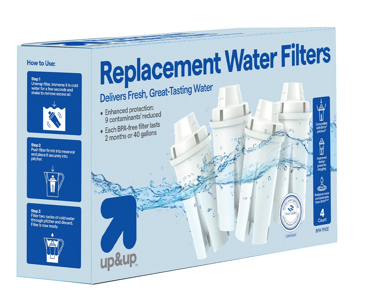
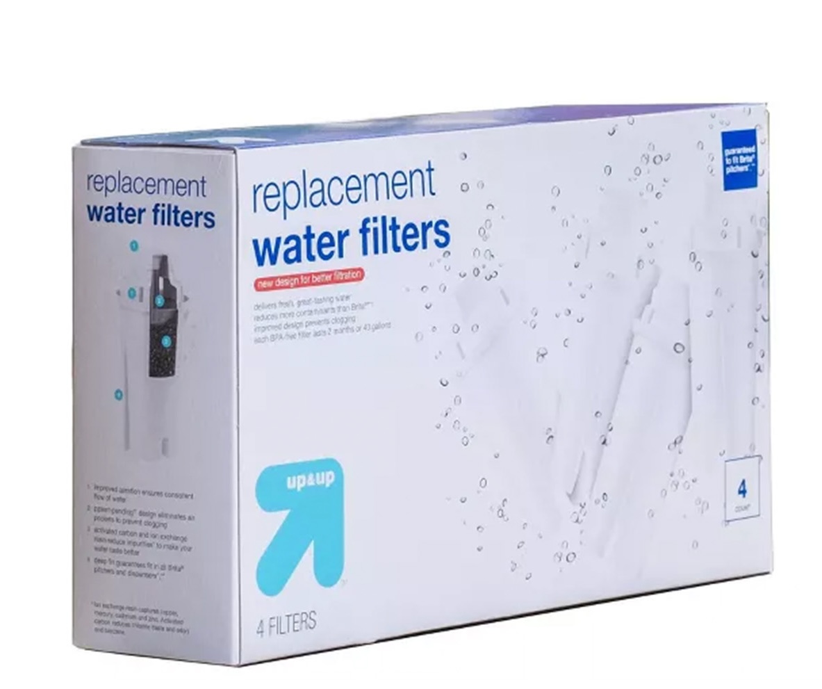
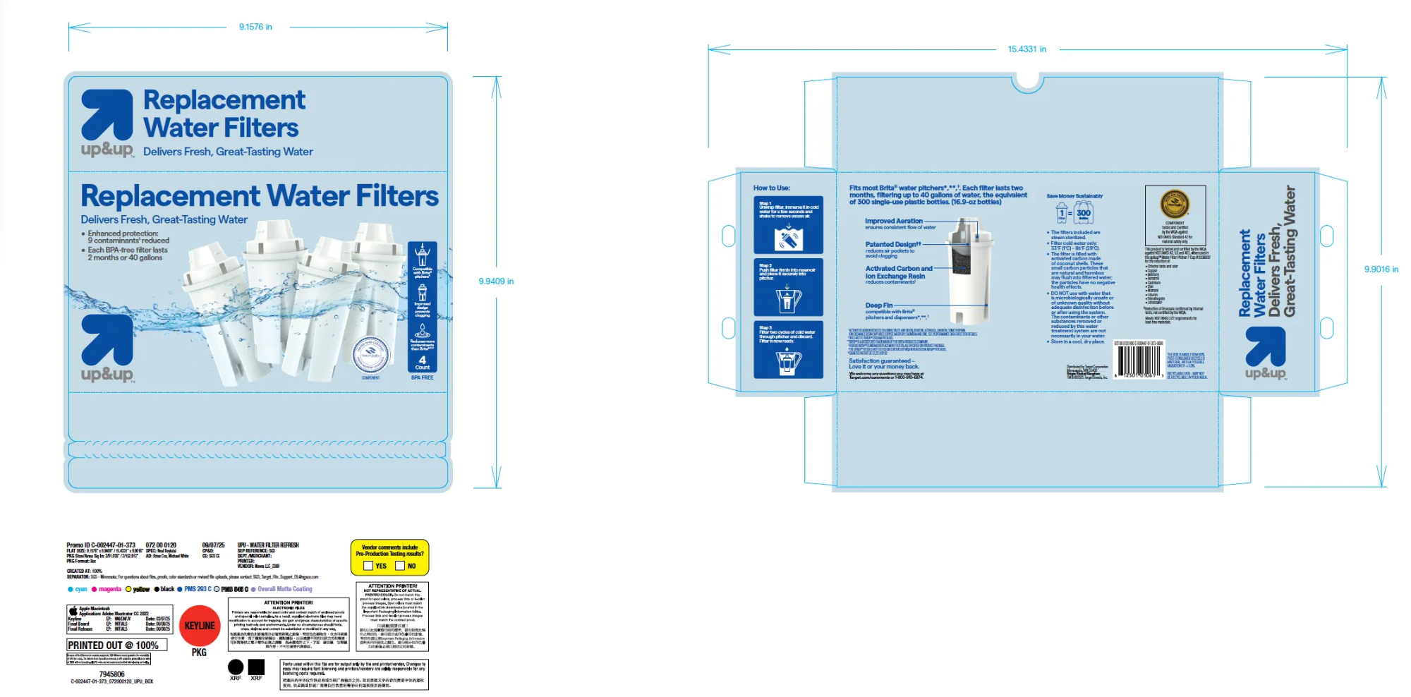
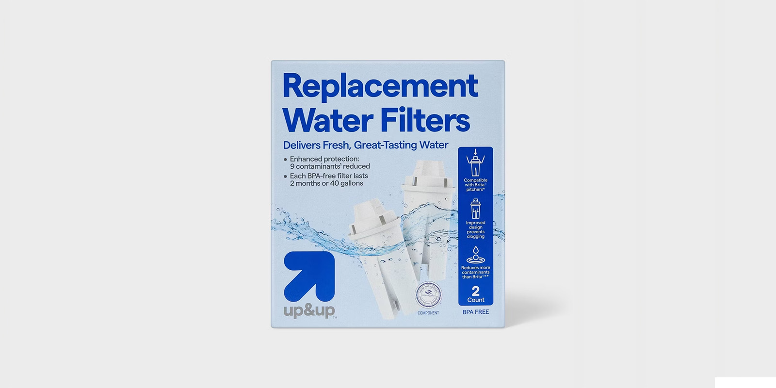
Making filters pop within the tightest brand guidelines in retail. Target's Up&Up system leaves almost no room for creativity. Almost.

Retailer
Target · Up&Up
Scope
Packaging · Iconography · Art Direction
Status
Live in store

One of the most rigid brand systems in retail

Target's Up&Up packaging follows pre-defined layouts, font sizes, and graphic rules. But our packaging was getting lost on shelf especially against more graphic-heavy competitors like Brita.

Target packaging back panel Target packaging side panel how to use

Drag to compare

Drag the slider left or right to compare
After
Before
◀▶
Before
After

Two solutions within strict parameters

01
Enhancing filter visibility
A subtle underwater pattern behind the filters adds visual depth and movement making them eye-catching from a distance without violating a single brand rule.
02
Custom icon set for Target
A distinct icon style designed specifically for Target different from versions used at other retailers maintaining the perception of uniqueness.

Custom icons built for Target's system

Target icon set

Every panel production-ready

Target dieline